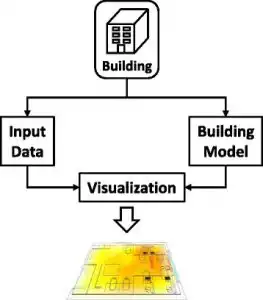
- Input Data Part – collection and selection of raw data from the sensors to generate input data
- Building Part Model – 2D floor plan or 3D building model is loaded, which becomes the background for visualization. Also, it includes all the factors that influence the temperature within the data center.
- Visualization Part – Transforming the numeric data into visual information
Effective temperature visualization is a fundamental part of running a data center. It helps the manager to avoid incorrect analysis of data and come to grips with the temperature condition. Temperature data can often be connected to a physical location. It can also have abstract temporal data that shows temperature changes at a given time. For every 30 seconds, one device can measure up to 2,880 single temperatures in a day. For a data center room containing 100 racks, this means 288,000 data points a day. Can you imagine those having more than hundreds of racks? Couple this with the data coming from the different server rooms that are all being processed concomitantly. This has been a challenge for data centers as multifarious temperature data sets cause limitations for data visualization.
Visualization Methods Using Temperature Sensors
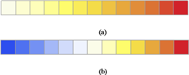
There are a variety of methods used in the visualization of temperatures. The most commonly used is colors. Colors are generally used in temperature visualizations to describe hot and cold values. Having that said, the use of color visualization should be carefully considered. A confusion may happen for colors have no significant meaning. do not mean additional insight. Color hue is recommended for categorical data. Categorical data contains one or more categories without intrinsic ordering. For ordinal data, color intensity is suitable. This data follows a strict and clear ordering of categories. As for the color, a warm red color depicts high temperature while blue is for cold low temperatures.
Aside from colors, some use lines, text, and graphs. Other temperature visualization methods are:
- A Scatter plot is a type of data visualization that shows the correlation between two different variables. The data is shown by plotting different data points between the x and y-axis. The dependent variable, such as time, is usually presented on the x-axis. The dependent variable is on the y-axis. There is no connection between the points so they look “scattered”. This look gives this type of data visualization its name. It often provides information about the trends instead of temperature changes between specific data points.
- A line diagram is a type of visualization used to represent the value of temperature over time. Just like the scatter plot, the line diagram is also consisting of the x and y-axis. However, data points are plotted and connected by a line into a “dot-to-dot” approach.
- Table lens is another type of temperature visualization method which dynamically explores a large amount of turbulent data. It reduces the required amount of display space by shrinking the height of the table rows. Columns accommodate variables while the rows represent data items. Bars with different lengths communicate data value by clicking on the row. This can be suitable to the data center by representing the temperature of each rack on a single row and details of the devices placed on the rack.
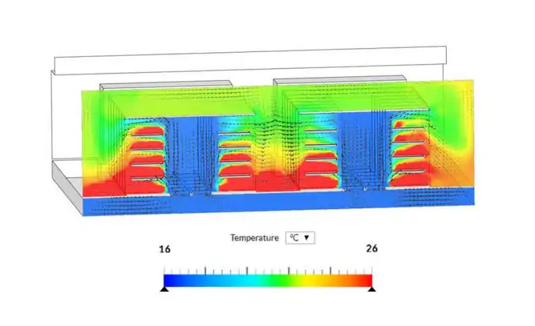
- Clustered heat maps can be also used in temperature monitoring where rack temperature is presented as a timeline. It consists of a rectangular tiling, with each tile shaded on a color scale. They represent the value of the corresponding element of the data matrix. Yet, this method can also show a confusing collection of data leading to failure to understand the large data sets.
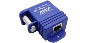
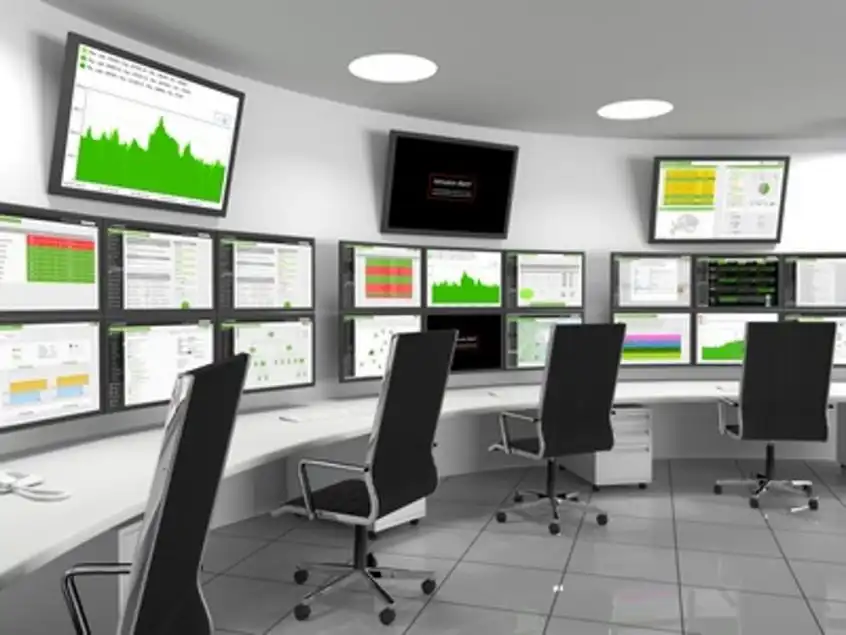
Single Port Temperature and Humidity Sensor
When you need to know the temperature of a room, enclosure, or cabinet this sensor can be used. Housed in a thermally conductive metal tube it is accurate and quick to react to changes in temperature. The sensor can be easily mounted with screws, adhesive, or optional DIN rail clips making it ideal to scatter around the facility as well. Combining temperature and humidity into one sensor frees up an additional intelligent sensor port on your base unit. Thresholds can be set for low and high warning and critical parameters. The built-in graphing function of the base unit gives you a pattern of temperature or humidity trends over time.
Cabinet Analysis Sensor
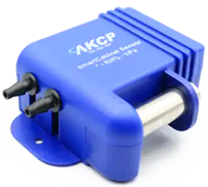
The Cabinet Analysis Sensor (CAS) features a cabinet thermal map for detecting hot spots and a differential pressure sensor for analysis of airflow. Monitor up to 16 cabinets from a single IP address with the sensorProbeX+ base units. The Wireless Cabinet Analysis Sensor is also available using our Wireless Tunnel™ Technology.
The cabinet analysis sensor combines differential pressure and cabinet thermal maps into one smart sensor. Sensors include:
- A string of 6x Temp sensors
- 2x Humidity for cabinet front and rear
Differential pressure sensor, check for proper pressure differential between front and rear. Ideal for hot and cold aisle containment to ensure proper airflow. AKCPro Server Rack Map View Use the CAS with dedicated rack map views on AKCPro Server. A visual representation of your cabinet, with airflow, front and rear temperatures, temperature differentials, and differential pressure.
Reference Links:
https://homebusinessmag.com/blog/technology-blog/top-3-main-components-data-center-important/
http://cumincad.scix.net/data/works/att/caadria2019_365.pdf
http://www.iaarc.org/publications/fulltext/isarc2014_submission_82.pdf
What Is a Scatter Plot and When To Use One
https://hal.inria.fr/hal-00656250/document
- About the Author
- Latest Posts

For over two decades at AKCP, I have been focused on a single mission: bringing complete visibility, security, and efficiency to the world’s critical infrastructure.
I believe that in the modern data center, AI is only as good as the data it receives. My goal is to ensure facilities have the precise sensor facts needed to control AI opinions, ultimately reducing PUE, releasing stranded capacity, and ensuring maximum uptime.